Advanced
Classes and DefaultStyleProvider
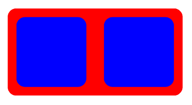
Koestlich implements support for classes and inherited property values. The following code shows how classes and the DefaultStyleProvider can reduce style descriptions. In the following example, one DefaultStyleProvider sets the borderRadius to 0.1 for all Containers. The borderRadius style is inherited and extended with margin = 0.1 from a second DefaultStyleProvider. The constant blue acts as a CSS class and assigns the backgroundColor to two components.
import { Canvas } from "@react-three/fiber";
import { OrbitControls } from "@react-three/drei";
import { RootContainer, Container, flexAPI, DefaultStyleProvider } from "@coconut-xr/koestlich";

const blue = {
  backgroundColor: "blue",
};

export default function App() {
  return (
    <Canvas>
      <OrbitControls enableRotate={false} />
      <DefaultStyleProvider borderRadius={0.1}>
        <RootContainer backgroundColor="red" width={2} height={1} flexDirection="row">
          <DefaultStyleProvider margin={0.1}>
            <Container flexGrow={1} classes={[blue]} />
            <Container flexGrow={1} classes={[blue]} />
          </DefaultStyleProvider>
        </RootContainer>
      </DefaultStyleProvider>
    </Canvas>
  );
}
Custom Property APIs
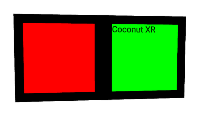
Koestlich allows the creation of custom properties for multiple component types. For example, in the following, we create the variant property, which takes the values danger and success and sets the background colors red and green, respectively, on components of the type image and container.
import { Canvas } from "@react-three/fiber";
import { OrbitControls } from "@react-three/drei";
import {
  RootContainer,
  flexAPI,
  buildComponent,
  ContainerNode,
  useContainer,
  useText,
  TextNode,
} from "@coconut-xr/koestlich";
import { Suspense } from "react";

const customAPI = {
  ...flexAPI,
  variant: (target: any, value: "danger" | "success") => {
    target.backgroundColor = {
      danger: 0xff0000,
      success: 0x00ff00,
    }[value];
  },
};

const CustomContainer = buildComponent(ContainerNode, useContainer, customAPI);
const CustomText = buildComponent(TextNode, useText, customAPI);

export default function App() {
  return (
    <Canvas>
      <OrbitControls />
      <RootContainer backgroundColor="black" width={2} height={1} flexDirection="row">
        <CustomContainer margin={0.1} index={0} flexGrow={1} variant="danger" />
        <Suspense>
          <CustomText index={1} flexGrow={1} flexBasis={0} variant="success" margin={0.1}>
            Coconut XR
          </CustomText>
        </Suspense>
      </RootContainer>
    </Canvas>
  );
}