Buttons
Displays a button.
Icon Button

Code Example
import { Button, Glass, IconButton } from "@coconut-xr/apfel-kruemel";
import { Container, Text } from "@coconut-xr/koestlich";
import { BoxSelect } from "@coconut-xr/lucide-koestlich";

export default function IconButton() {
  return (
    <Glass borderRadius={32} padding={16}>
        <IconButton size="md">
            <BoxSelect />
        </IconButton>
    </Glass>
  );
}
Sandbox
Icon Button Params
| Name | Type | Attributes | Description |
|---|---|---|---|
| size | Size | optional / default: "md" | Sets the size of the button. Options are "sm" / "md" / "lg" |
| platter | boolean | optional / default: false | If true, changes the appearance of the icon button to a platter state |
| selected | boolean | optional / default: false | If true, changes the appearance of the icon button to a selected state |
| disabled | boolean | optional / default: false | If true, disable all interactions for the button |
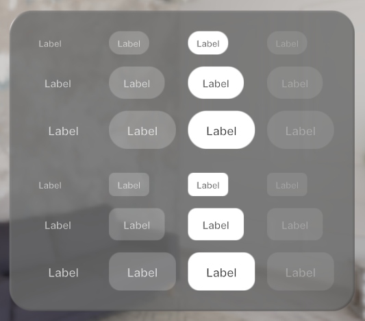
Text Button
Code Example
import { Button, Glass, IconButton } from "@coconut-xr/apfel-kruemel";
import { Container, Text } from "@coconut-xr/koestlich";
import { BoxSelect } from "@coconut-xr/lucide-koestlich";

export default function TextButton() {
  return (
    <Glass borderRadius={32} padding={16}>
        <Button style="rect" size="md" selected>
            <Text>Label</Text>
        </Button>
    </Glass>
  );
}
Sandbox
Button Params
| Name | Type | Attributes | Description |
|---|---|---|---|
| size | Size | optional / default: "md" | Sets the size of the button. Options are "sm" / "md" / "lg" |
| style | Style | optional / default: "rect" | Style of the button. Options are "rect" / "pill" |
| platter | boolean | optional / default: false | If true, changes the appearance of the button to a platter state |
| selected | boolean | optional / default: false | If true, changes the appearance of the button to a selected state |
| disabled | boolean | optional / default: false | If true, disable all interactions for the button |