Input
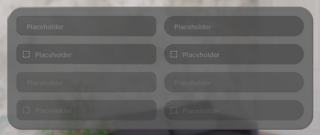
Displays an input field.
Code Example
import { Glass, TextInput } from "@coconut-xr/apfel-kruemel";
import { BoxSelect } from "@coconut-xr/lucide-koestlich";

export default function CheckboxesPage() {
  const [text, setText] = useState("");
  return (
    <Glass borderRadius={32} padding={16} flexDirection="row" gapRow={16}>
        <TextInput value={text} onValueChange={setText} style="rect" placeholder="Placeholder" />
        <TextInput
            value={text}
            onValueChange={setText}
            style="rect"
            placeholder="Placeholder"
            prefix={<BoxSelect />}
        />
        <TextInput
            value={text}
            onValueChange={setText}
            style="rect"
            placeholder="Placeholder"
            disabled
        />
        <TextInput
            value={text}
            onValueChange={setText}
            style="rect"
            placeholder="Placeholder"
            disabled
            prefix={<BoxSelect />}
        />
    </Glass>
  );
}
Sandbox
Params
| Name | Type | Attributes | Description |
|---|---|---|---|
| style | Style | optional / default: "rect" | Style of the input field. Options are "rect" / "pill" |
| disabled | boolean | optional | If true, disable all interactions for the input field |
| placeholder | string | optional | A short hint displayed in the input field before the user enters a value |
| value | string | - | The value of the input field |
| onValueChange | (value: string) => void | optional | Callback fired when the value is changed |
| prefix | RectNode | optional | Customizable prefix displayed at front of the input field |