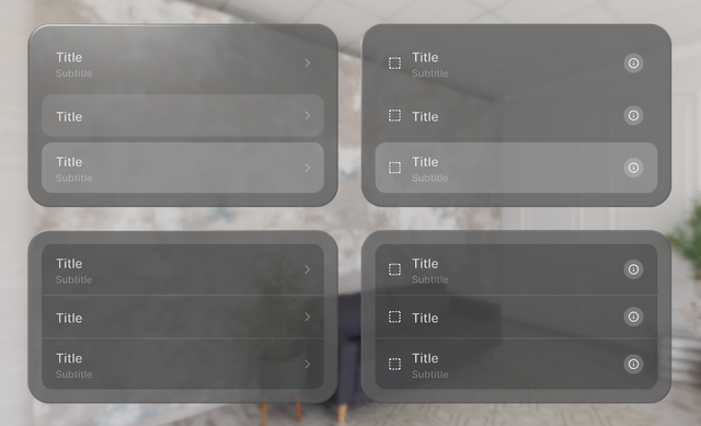
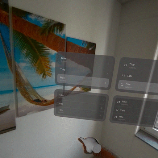
List
A component enabling a visual arrangement of items presented in a structured format.
Code Example
import { Glass, IconButton, List, ListItem } from "@coconut-xr/apfel-kruemel";
import { Text } from "@coconut-xr/koestlich";

export default function List() {
  return (
    <Glass borderRadius={32} padding={16}>
        <List type="plain" width={400}>
            <ListItem subtitle={<Text>Subtitle</Text>}>
                <Text>Title</Text>
            </ListItem>
            <ListItem>
                <Text>Title</Text>
            </ListItem>
            <ListItem
                subtitle={<Text>Subtitle</Text>}
                selected
            >
                <Text>Title</Text>
            </ListItem>
        </List>
    </Glass>
  );
}
Sandbox
Params
List Item
| Name | Type | Attributes | Description |
|---|---|---|---|
| subtitle | ReactNode | optional / default: "rect" | Customizable subtitle of the item |
| selected | boolean | optional | If true, apply selected styling |
| leadingAccessory | ReactNode | optional | Customizable accessory displayed at the front of the list item |
| trailingAccessory | ReactNode | optional | Customizable accessory displayed at the end of the list item |
| isFirst | boolean | optional | If true, apply styling for first item in the list. |
| isLast | boolean | optional | If true, apply styling for last item in the list. |
List
| Name | Type | Attributes | Description |
|---|---|---|---|
| type | Type | optional / default: "plain" | Style of the list. Options are "plain" / "inset" |