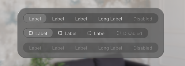
Segmented Controls
A component enabling the user to make a choice among a set of mutually exclusive options.
Code Example
import {
  Glass,
  SegmentedControl,
  SegmentedControlButton,
} from "@coconut-xr/apfel-kruemel";

export default function SegmentedControl() {
  return (
    <SegmentedControl defaultValue={1}>
        <SegmentedControlButton value={1}>
            <Text>Label</Text>
        </SegmentedControlButton>
        <SegmentedControlButton value={2}>
            <Text>Label</Text>
        </SegmentedControlButton>
        <SegmentedControlButton value={3}>
            <Text>Label</Text>
        </SegmentedControlButton>
        <SegmentedControlButton value={4}>
            <Text>Long Label</Text>
        </SegmentedControlButton>
        <SegmentedControlButton value={5} disabled>
            <Text>Disabled</Text>
        </SegmentedControlButton>
    </SegmentedControl>
  );
}
Sandbox
Params
Segmented Control
| Name | Type | Attributes | Description |
|---|---|---|---|
| value | T | optional | The current selected segment of the segmented control |
| defaultValue | T | optional | The default selected segment of the segemented control |
| onValueChange | (value: T) => void | optional | Callback that is fired when the user selects a new segment |
| disabled | boolean | optional / default: false | If true, disable all interactions for the segemented control |
Segmented Controll Button
| Name | Type | Attributes | Description |
|---|---|---|---|
| value | T | - | The current value of the segmented control button |
| disabled | boolean | optional / default: false | If true, disable all interactions for the segemented control button |